
How to change a people's perception of a brand who had a bad reputation?

VADIA could mean 2 things in portuguese: "slut" or "person who likes to wander in city". Unfortunately, due some bad communication choices in the past, VADIA brand was associated to the first one and this leeds to a low brand awareness.
The rebranding was crucial to make the brand more urban and artsy, closer to the second meaning. To accomplish that, the concept was to represent the wander path, through a wavely hand-brushed line.
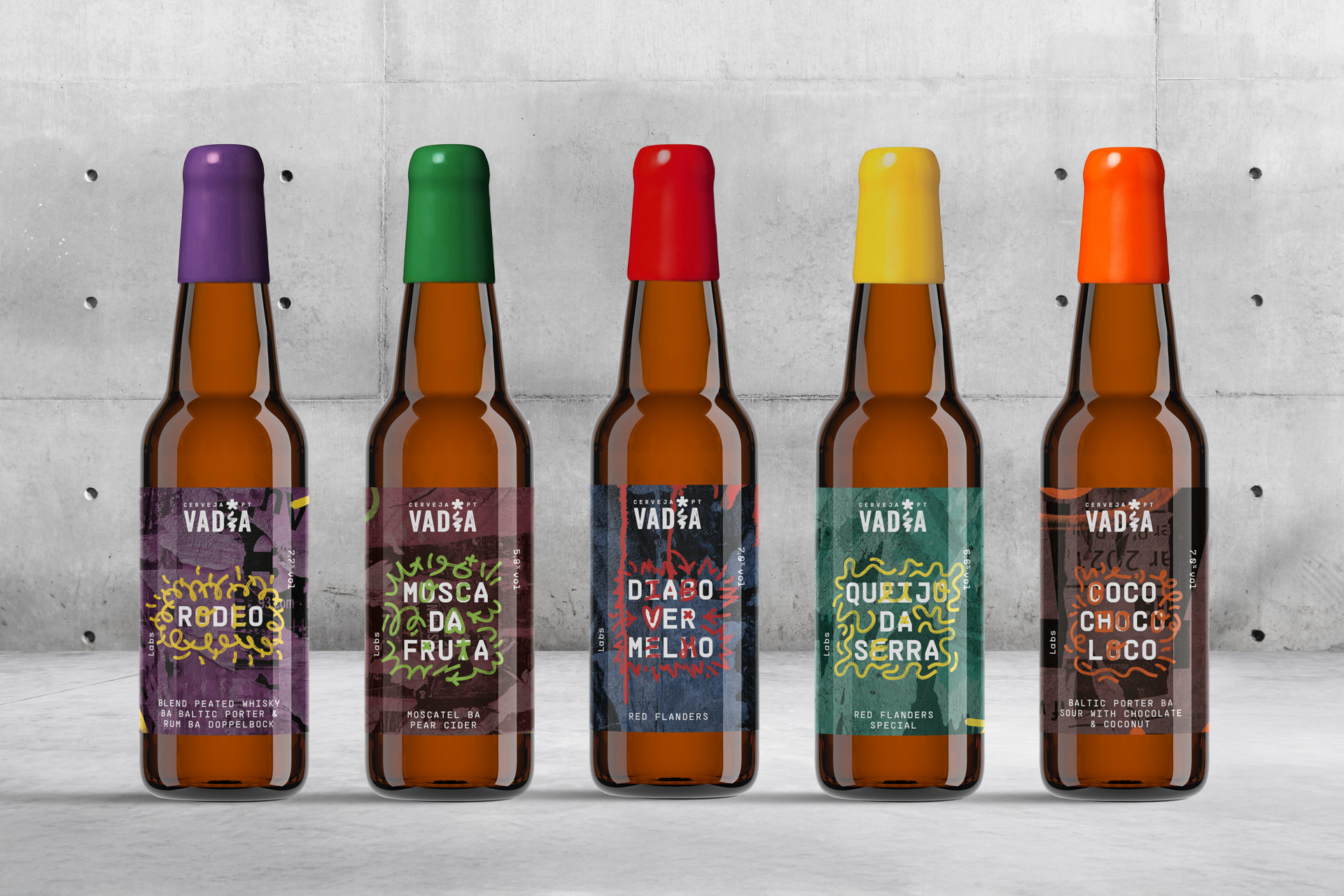
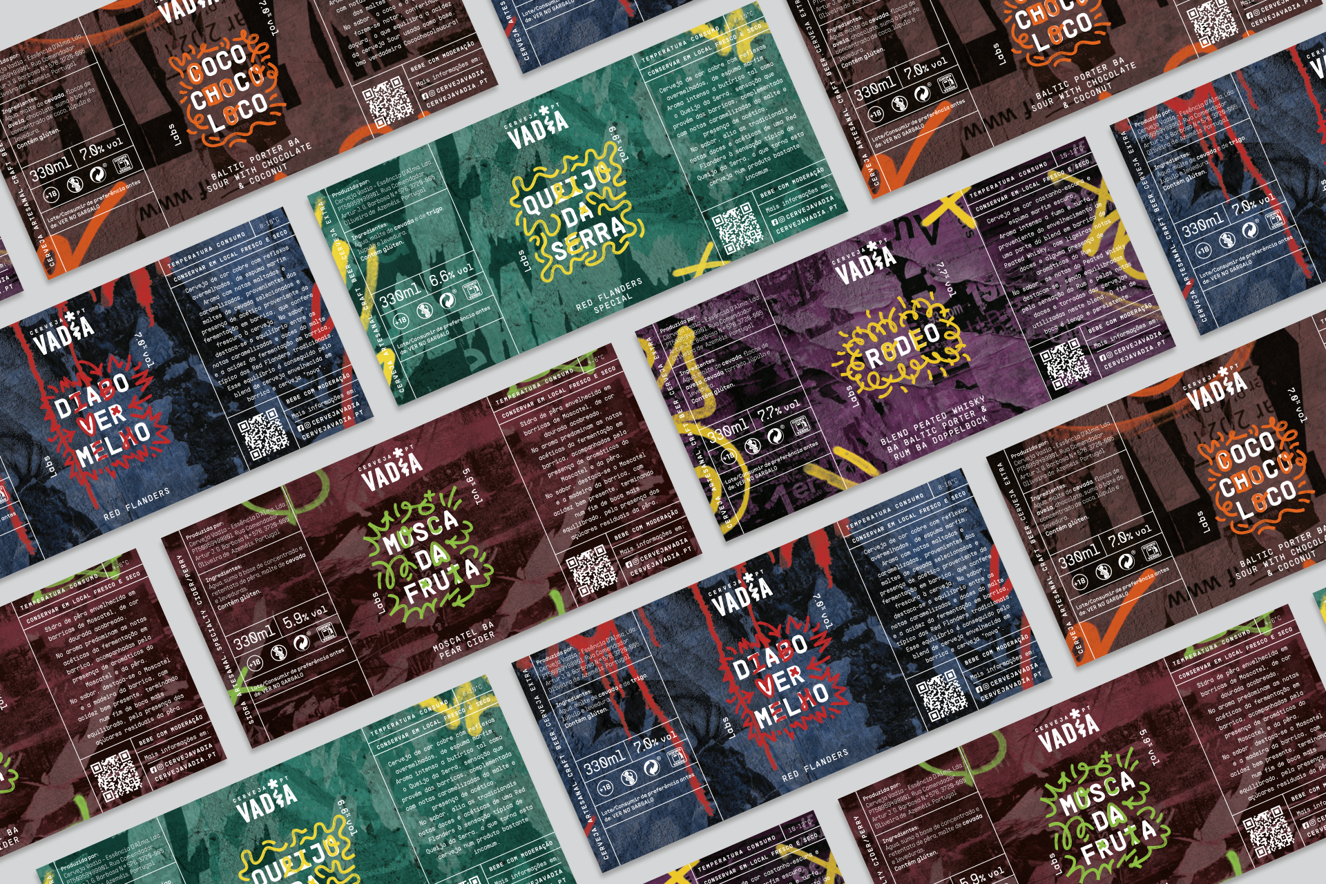
This irreverent aesthetic served as the foundation for the overall redesign. Every aspect was meticulously crafted, including how the beers are displayed on shelves, tap handles in bars, e-commerce packaging, street campaigns, label structures for six distinct beer ranges, and merchandising.
The logo is an irreverent part of the brand, with the custom "I", making it very easy to use in every material and be more recognizable.


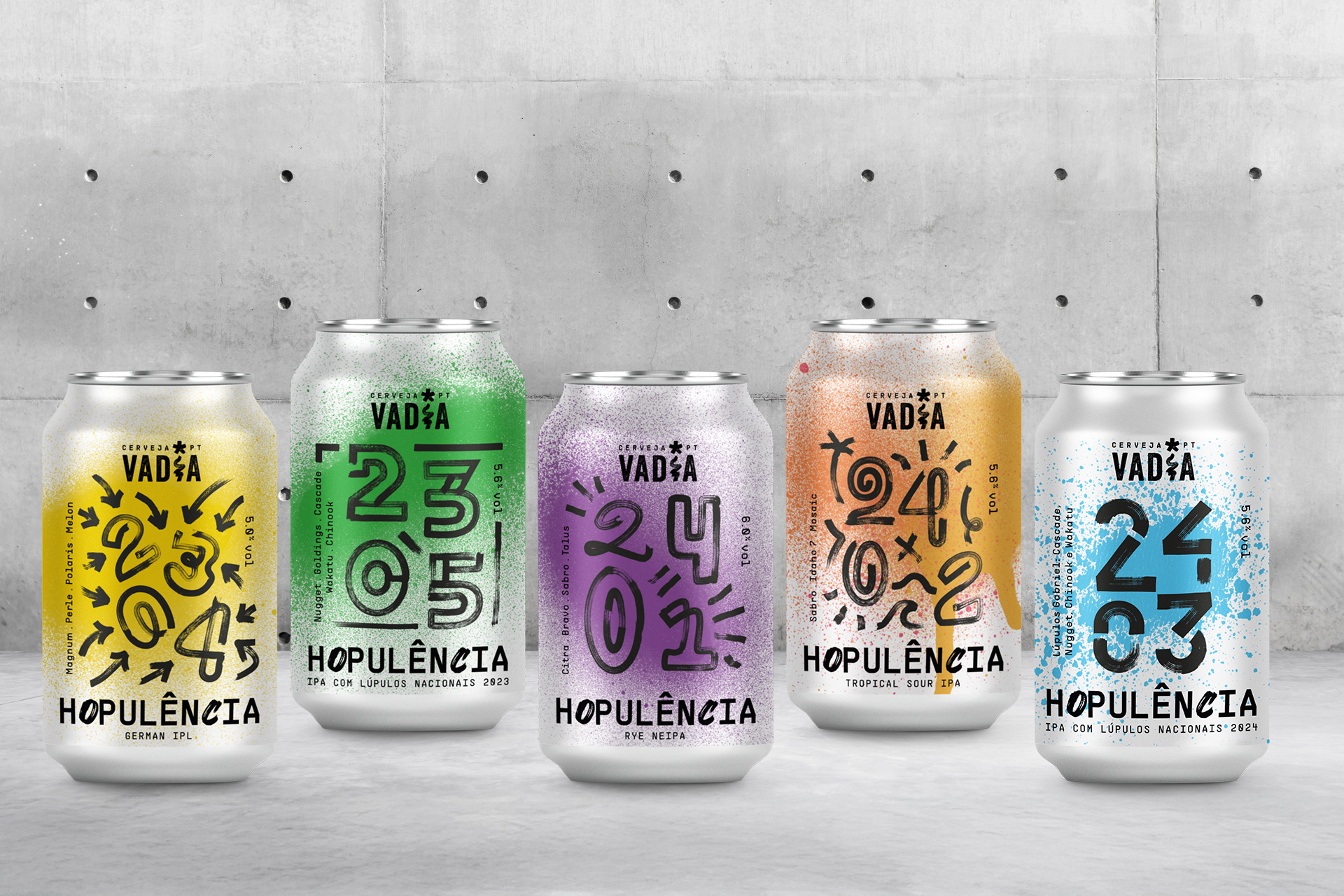
For the core range, with highly visibility in the supermarket shelves, the main focus was work in their shelve impact.
Using the craft line concept i create a series of labels with interconnected lines that make a big impact when put side-by-side as well as stand alone too. The complexity of the line is linked to the complexity of the beer also.
Another aspect of this labels, are the handbrushed letters in the name of the beers, that transmits their unconformity with the status-quo.


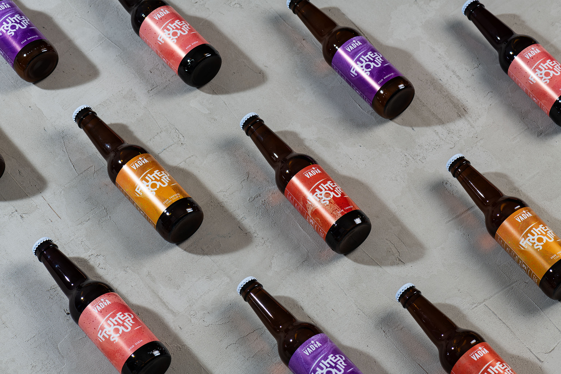
The Cider range had three important aspects to take in consideration: keep the consistency of the main brand, be clear that this is a different product and be different from the competition.
The answer was, white transparent bottle, with white marker apple drawings and splashes of contrasting color.
The apple drawing indicates the apple based beverage and the transparent bottle allows to see the different flavours.


