Can a craft beer brand have a versatile visual identity that seamlessly adapts to its diverse everyday needs?

Cerveja Letra wanted to redesign their “LETRA ON OAK '' range, a range of barrel aged beers.
My goal was to create a typographic logo that connects with the umbrella brand LETRA (meaning 'letter') while also designing a versatile symbol that could be easily applied to various materials, such as merchandising. I chose the 'O' as the symbol, inspired by the top of a barrel.
For the labels, I drew inspiration from the randomness of ink drops spreading on paper, using a watercolor technique to echo the spontaneous and unpredictable processes that occur inside the barrels. To highlight the uniqueness of each beer, I designed distinct organic-shaped labels for each reference and implemented a color-coding system to differentiate the beers.


The brand aimed to restyle their craft beer range, 'Minho Perspectives,' with the only requirement being to retain photos of the Minho region in the background, which inspired the range's name.
The solution features a black frame on the front of the can that highlights a specific detail in the image, creating a distinctive visual element for shelf recognition. This frame also serves as a space to showcase the beer's name, style, and logo (or logos, in the case of collaborations).
On the reverse side, a compact black shape neatly organizes all the necessary but less prominent information, ensuring a clean and balanced design.


The need to create cool merchandising inspired me to introduce a unique illustration style to LETRA's visual identity.
This style features hand-drawn black line illustrations with a strong emphasis on 3D lettering ('LETRA'), forming the foundation of the merchandising line. It blends the craft beer universe with specific elements of the LETRA brand, such as a beer can with the 'Minho Perspectives' frame design and the their hop plantation located next to the brewery.


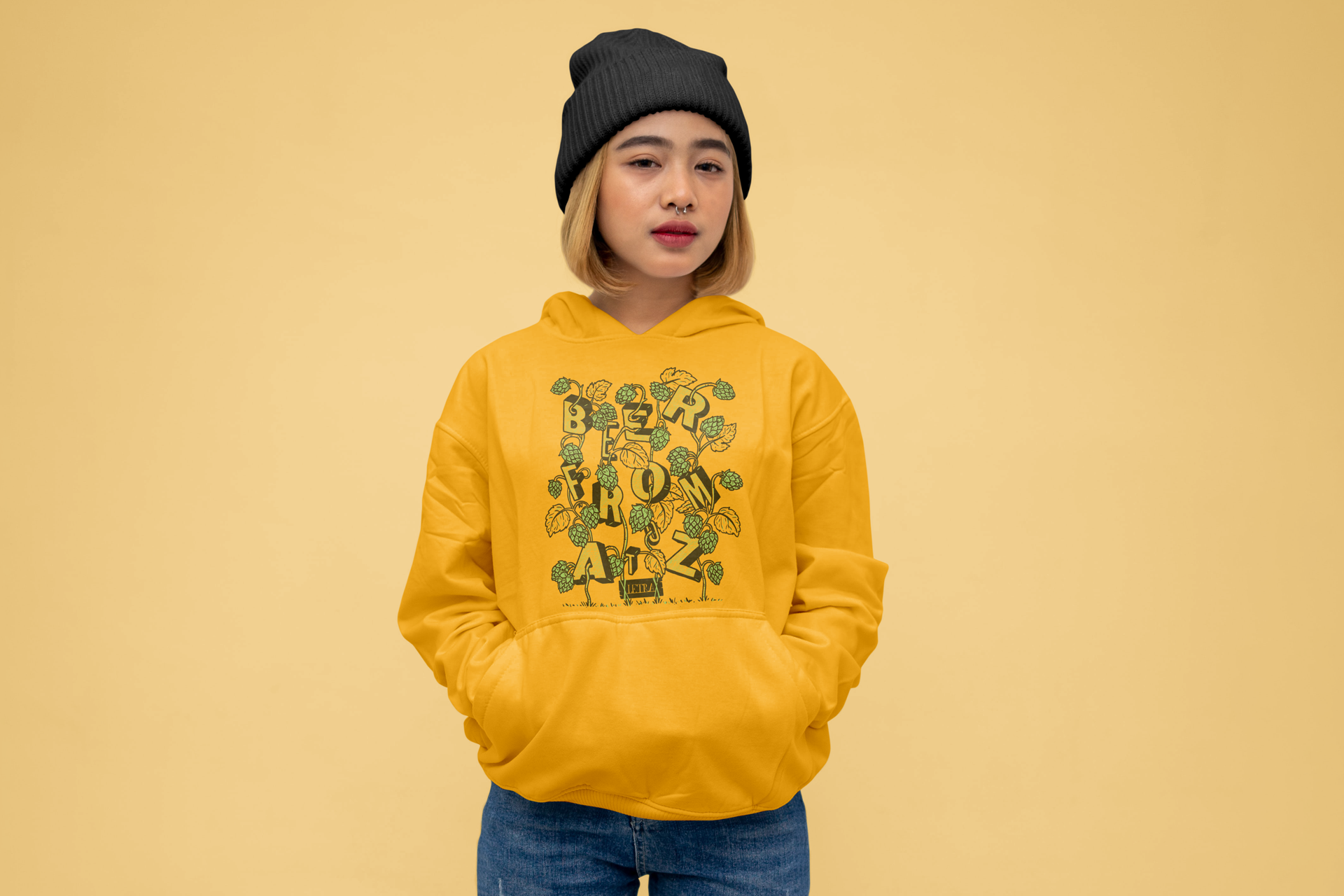
Letra needed a six-bottle box to serve as a special gift option for their clients.
I designed a simple yet versatile kraft-and-black box featuring the motto 'BEER FROM A TO Z,' which can be customized with stickers.
To complement this, I created a series of stickers in LETRA's custom illustration style, celebrating special occasions like Christmas, anniversaries, Father’s Day, Valentine’s Day, and more—all thoughtfully connected to the LETRA universe.


A 10th anniversary is a milestone worth celebrating. To mark the occasion, I designed a campaign centered around the motto 'Beer You Can Count on Your Fingers' ('Cerveja que se conta pelos dedos').
The concept features the two founders’ hands, tattooed with the 10 most significant moments in the brand's history. These moments were brought to life through a series of 10 unique illustrations, forming a commemorative package for the celebration.
The illustrations were showcased in a special 10-can anniversary pack and repurposed as engaging animations for social media and other platforms.


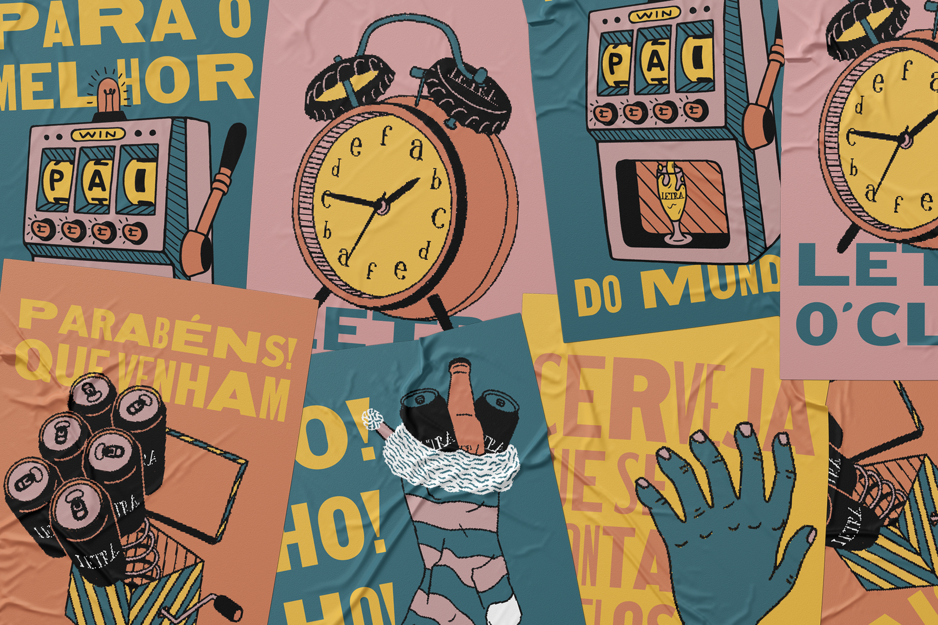
"LETRARIAS are the taproom bars of LETRA, and murals are a fantastic way to creatively transform a bar’s walls. Beyond adding vibrant color, murals serve as an opportunity to showcase the brand's visual identity and create an eye-catching spot for social media-worthy photos.
For these murals, the concept was to incorporate LETRA's custom illustration style, featuring bold 3D letters combined with iconic elements of the cities. The letters spell out the city’s name, while the surrounding illustrations offer a picturesque representation of its landmarks.


