How can a coffeeshop’s identity balance warmth and boldness?
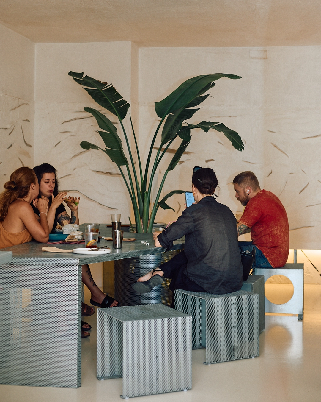
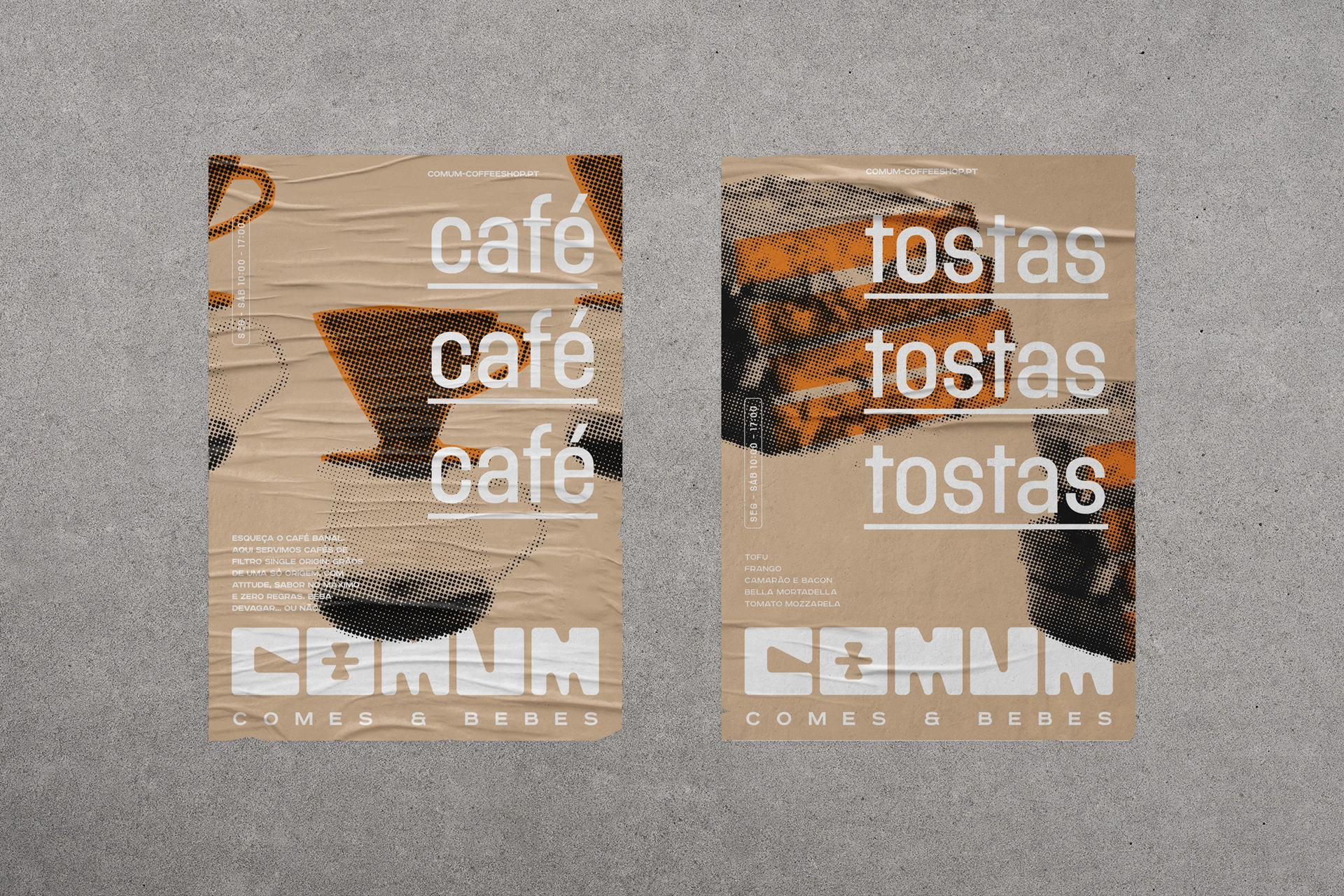
The COMUM branding captures the essence of a place where great coffee meets decadent deli sandwiches. Inspired by the architectural project, the visual identity builds on the use of perforated metal sheets and beige burlap, translating them into a strong and modern brand language.
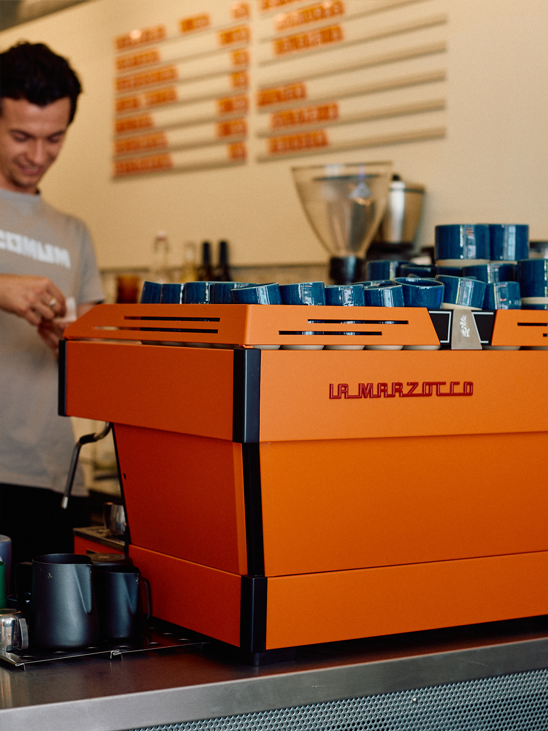
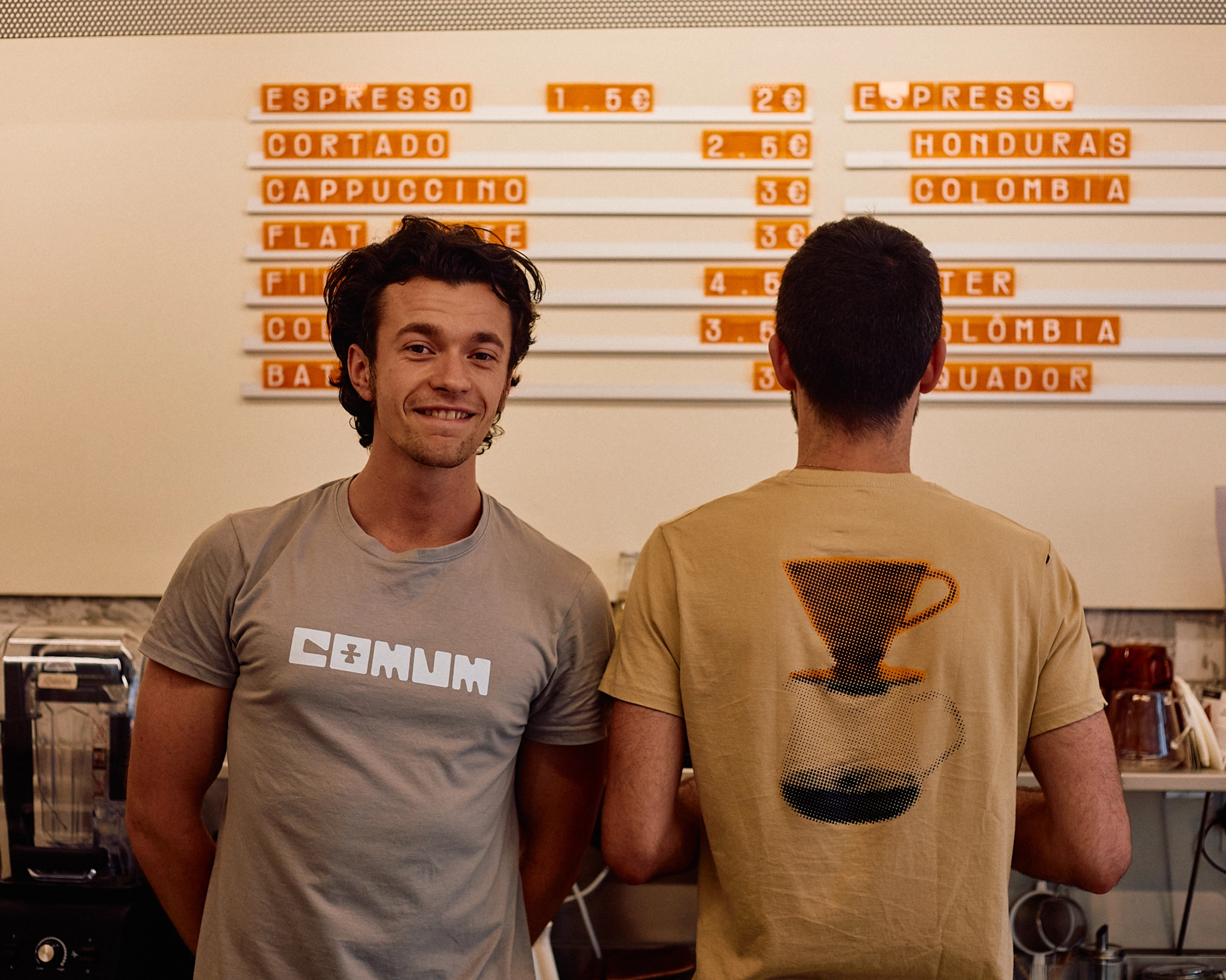
The typographic logo was designed directly on the perforated grid, while halftone illustrations echo the same texture and rhythm. To enrich the material palette, translucent orange acrylic was introduced across key brand touchpoints – from a custom letterboard to an A-Board and interior signage. These vibrant accents bring a playful contrast to the neutral tones of beige and grey, creating a cohesive and distinctive atmosphere that bridges space and identity.