How do you create an impactful brand for a bold festival maker?
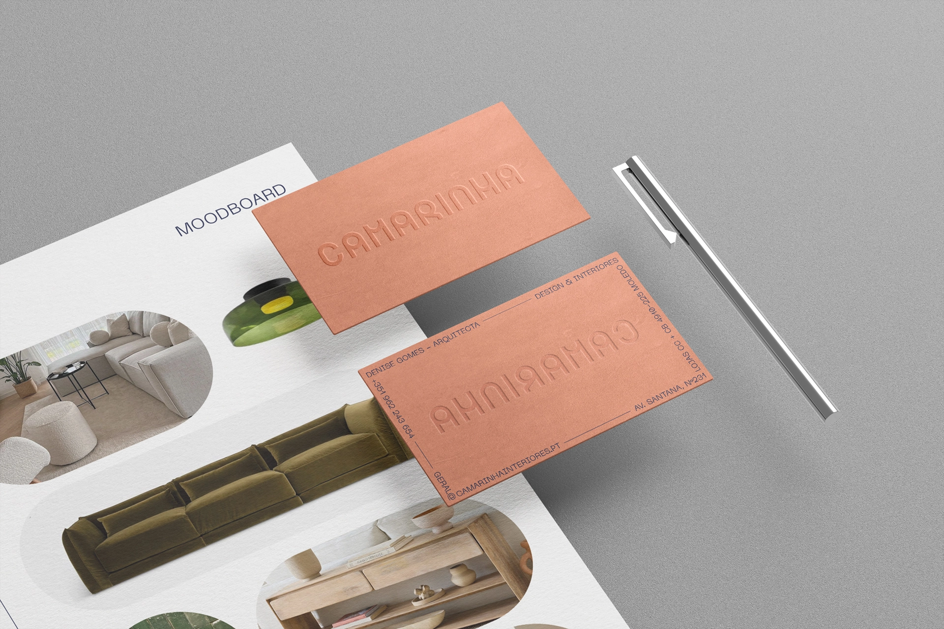
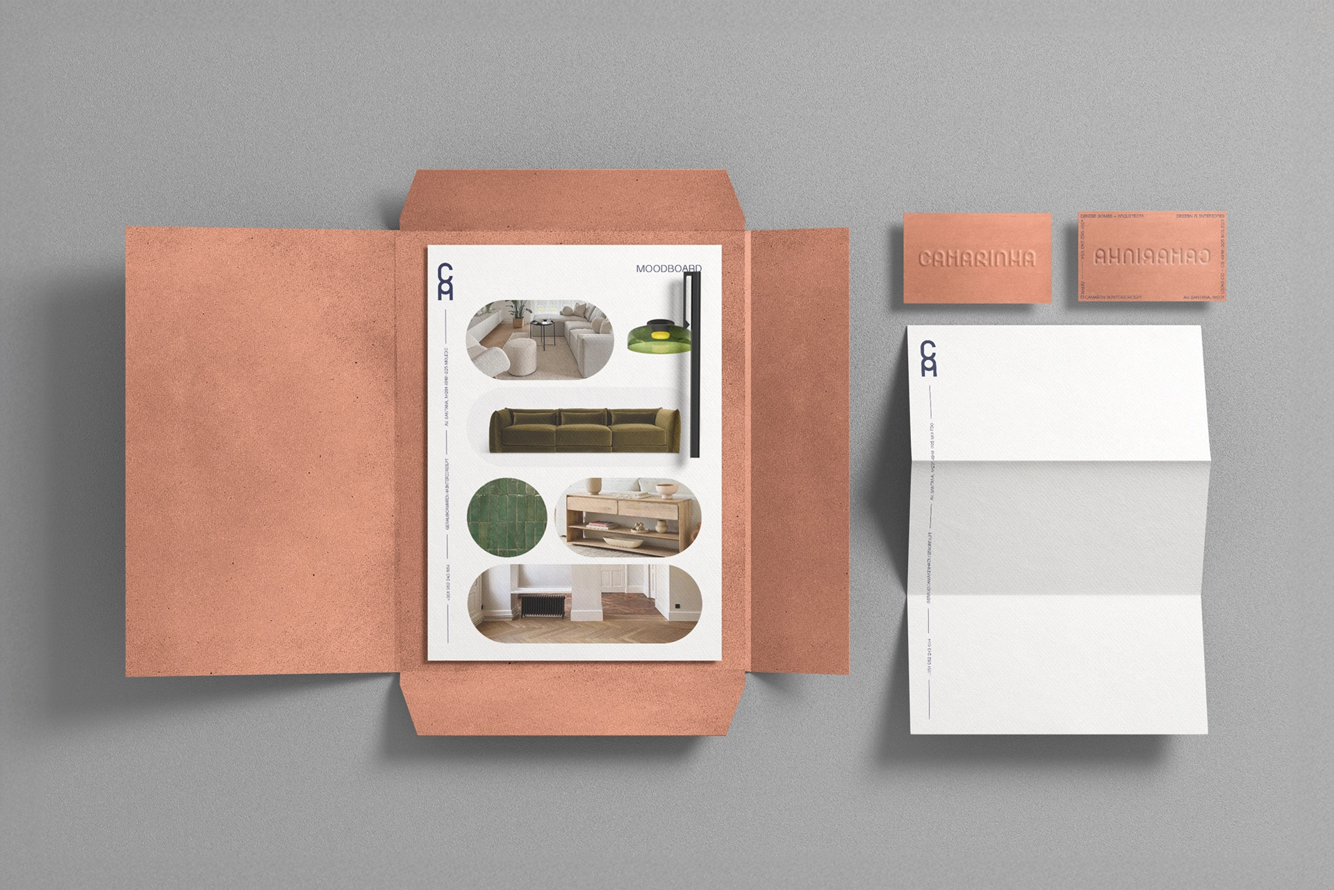
CAMARINHA is an interior design studio and curated design store that needed a visual identity capable of capturing both the architectural precision and the creative boldness of their work.
The new identity is built on rounded, organic typography that conveys a sense of harmony and balance, while still maintaining a strong architectural presence. This duality reflects the nature of the studio’s projects—carefully designed spaces with a human, approachable dimension.
The chosen color palette breaks away from conventional interior design aesthetics, embracing bold and creative tones that mirror the studio’s unique approach. Paired with clean layouts and subtle embossing details, the result is a brand that feels timeless, distinctive, and full of character.